Concordia.ca navigation gets a boost
Navigating through Concordia’s website just got easier.
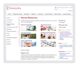
Concordia.ca reflects the last phase of a major redesign project that began earlier this year. This latest redesign, which went live on October 3, involved folding the Human Resources website into Concordia.ca, as well as completing the initial integration of the alumni relations and giving websites — all in a bid to provide a more streamlined and consolidated source of information.
“Each time we integrate websites that come with their own content, look and feel, navigational structure and target audiences, we are compelled to review our overall information architecture to make sure it makes sense to our visitors,” explains Web Communications Director Lucy Niro.

“Through monitoring our web statistics closely, feedback and usability test results, we found that we had to provide more visibility to our large and growing community of alumni and donors. We also learned that visitors were searching for information about student services in the campus life section.”
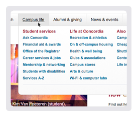
That’s why the top-level navigational menu items now include alumni and giving, and an expanded campus life section featuring student services.
The landing page of the new campus life section will highlight some photos that were submitted as part of the "Slice of Campus Life" Photo Contest, which wrapped up on October 1.
“We didn't make a lot of cosmetic changes; the ultimate goal was to enhance the user experience by making it as easy as possible for users to find information," Niro says.

As a result, the site features a navigational tool called mega drop-down menus to help visitors navigate through information-rich areas.
"Because of the sheer volume of information the site holds, our navigational structure had to better reflect our rich and dynamic content. Now, when users hover over a top-level menu category, they get a quick snapshot of the content areas within it.”
The redesign project’s first phase, completed on March 2, 2011, included a major overhaul of the look and feel, as well as the information architecture. The second phase focused on the addition of an advanced search tool.
Going forward, there are plans to enhance social media and mobile efforts.
"Our objective is to become more interactive and dynamic, and I think we are doing that. Now we want to keep that momentum," Niro says.
Related link:
• Provide feedback

