This is an advanced component reserved for use by the UCS Web team. The Carousel component requires specific resources from users that need to be discussed. AEM authors may update existing Carousels but should not create new ones.
Carousel component
The Carousel component displays a set of rotating slides at the top of a landing page. A slide consists of the following elements that are part of the page's banner properties:
- background image
- text
- call-to-action
- link to another page

| Field name | Description |
|---|---|
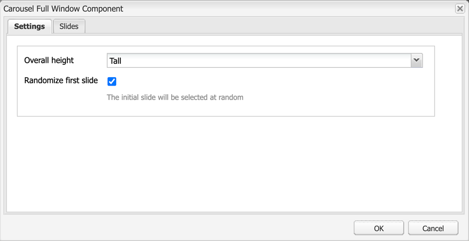
| Overall height |
|
| Randomize first slide | If checked, the initial slide will be selected at random |
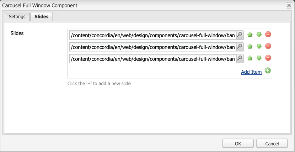
Slides
- Click Add Item to add the pages you want to list in the carousel. Ideally, you should post between 3–6 slides.
- Click the magnifying glass to access the tree and create relative links.
- Click the '+' to add a new slide.
- Order the links using the up and down arrows.
- Delete a link by clicking on the red dot.
Guidelines
Full window carousels should only be used on a site or subsite's HOME page.
Full Window Carousels are designed to drive users to timely, key content on your site.
Before you add a page link to the Full Window Carousel component, you must set up the banner image and banner properties of that page.
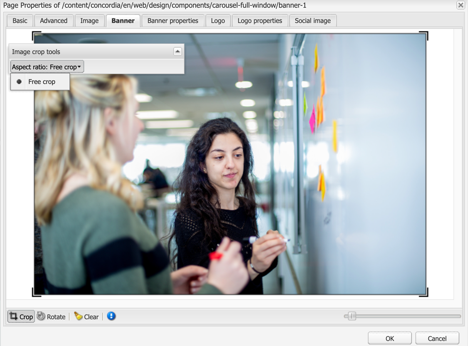
1. Add image to your destination page
- Go to the destination page (the page that your carousel will link to).
- Open its page properties.
- Add the carousel image to the Banner Image tab.
- If needed, you can adjust the image crop with the Free crop aspect ratio option.
- Only use images that do not exceed, or have a width and/or height that is less than, 1920px.
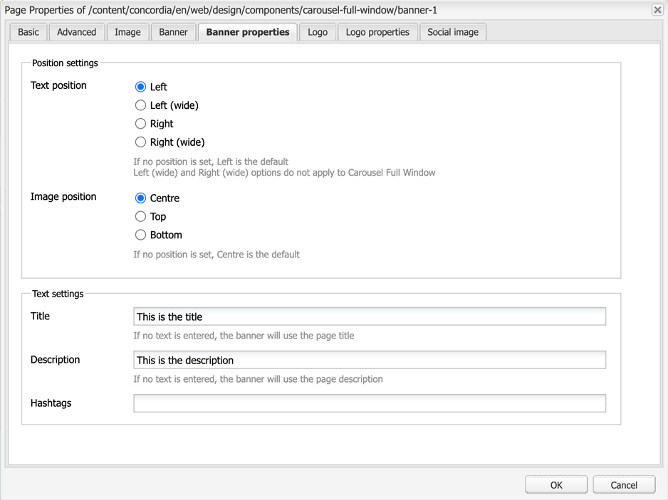
2. Set up the banner properties
- Fill out the Banner Properties tab
- Text position: Text can be placed on the left or the right. Select the option that works best with the banner image.
- Image position: Centre, Top or Bottom.
- Title: Add your headine. If no text is entered, the banner will use the page title.
- Description: A subtitle or brief one-sentence overview.
- Hashtags: A hashtag can be added if your page is related to a social media campaign.
3. Add the page paths to the Full Window Carousel component
Once you have all this in place, go to the Full Window Carousel component and add the link to the page in the component.
Accessibility
- The Full Window Carousel has a pause/play button.
- Users who find the movement distracting can pause the animation.
- Users who need more time to read the content can pause the carousel.
- The Full Window Carousel has two forms of navigation:
- Previous and next arrows allow users to manually navigate through items.
- A dot navigation (small circles) to navigate through banners exists in the bottom middle of the carousel. The number of circles corresponds to how many banners are in the rotation.
- Slide banner images are decorative background images and do not use Alt text.
Dos
- Do use images that are at 1920px in width.
- Do keep the Title and Description text short and clear.
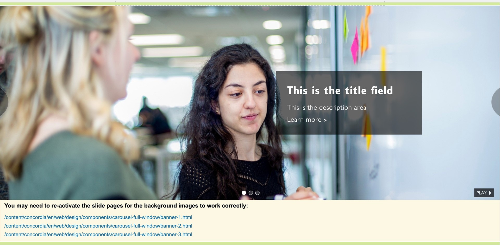
- Do use images that work well in the format. The carousel below works well with the person's face on the left and the text positioned on the right.
- Do use 3–5 slides.

Don'ts
- Don't add a Full Window Carousel to your page without consulting the UCS Web team first. Carousels require high quality images, and they need to be changed on a regular basis.
- Don't link to pages outside of AEM from the carousel.
- Don't add more than 6 slides. Users will not scroll through too many slides. An ideal range is 3–5 slides.
- Don't use low resolution images for the Full Window Carousel. Images that are not sized at 1920px will appear pixelated.
- Don't use images that do not work well in the format. In the carousel below, one of the person's faces is cut off.

Author mode
- The paths to the slide pages appear in yellow under the Full Window Carousel component.
- If you have used the crop tool to adjust the banner image in page properties, but you do not see the adjusted crop in the Full Window Carousel, re-activate the slide page to see the update.
Mobile display
- On mobile, the entire banner is clickable.
- The automatic rotation is disabled; the user can navigate using the left and right arrows.
- The dot navigation indicates the number of slides in the rotation. On mobile, the dot navigation is not tappable.
- The title of the banner appears beneath the image. The description, call-to-action and hashtag text do not display on mobile.

Need support?
The Web team is here to help.