This is an advanced component. Consult a UCS webmaster to determine if the Tiles component is the best solution for your use case.
Tiles component
The Tiles component is used to lay out content side-by-side in columns.

Component(s) you might want to use with this one:
No gutter: remove the gutter (white space) between tiles
Double margin: increase the gutter (white space) between tiles. This feature only applies to 2 tiles.
Responsive settings: set the number of tiles to ‘stack‘ vertically when the page is viewed on a tablet or mobile phone. This depends on the number of columns and tiles since tablets can typically accommodate more content on a wider screen vs. a phone. If in doubt, leave the settings at the default values (i.e., “1” for both tablet and mobile).
Accessibility
The Tiles component provides a method for laying out content in columns that is both accessible and responsive.
When using the Tiles component, follow accessibility best practices for all of the content in the tiles (e.g., heading hierarchy, alt text on images, descriptive link text, etc.).
Six tiles in a row
Resize the browser window to see the tablet and mobile display stack to three rows of two icons.


Column Control component settings
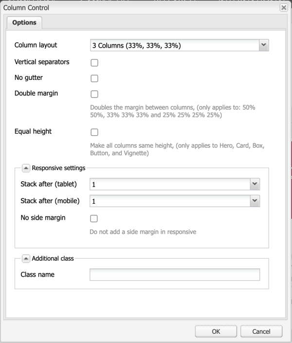
- Column layout: 3 Columns (33%, 33%, 33%)
- Stack after (tablet): 1
- Stack after (mobile): 1
All other options left disabled or default (blank)
Tiles component settings
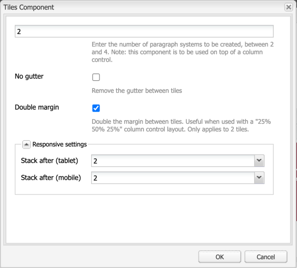
- Paragraph systems (tiles): 2
- Double margin: enabled
- Stack after (tablet): 2
- Stack after (mobile): 2
All other options left disabled or default (blank)
Dos
- Do consider whether the content is suitable for and best served by dividing up a Column Control component with the Tile component.
Don'ts
- Don't use a Tile component in place of a Column Control component.
- Don't nest a Tile component inside another Tile component.
- Don't use a Tile component as a table if in fact a table is needed to present tabular data.
- Don't use a Tile component to lay out Heroes, Cards or Buttons.
- Don't display too many Tiles in a narrow space.
Need support?
The Web team is here to help.