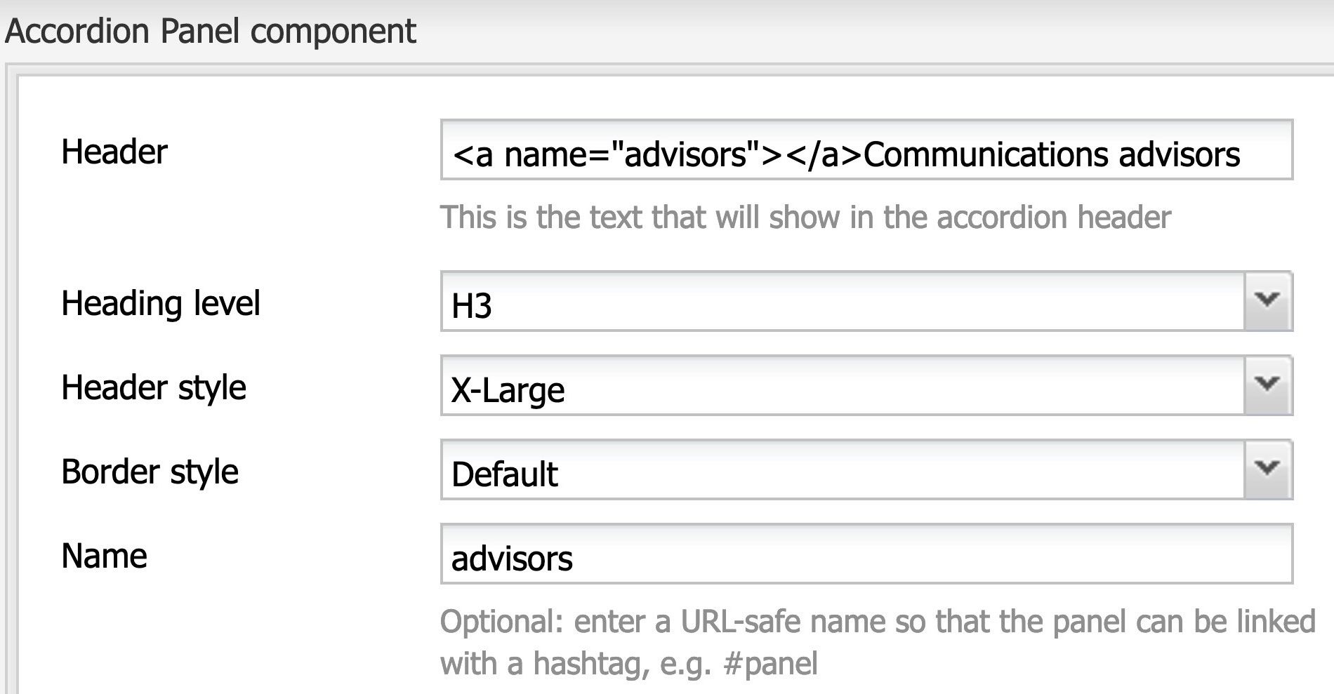
- Open the accordion panel for editing.
- In the Header field, copy and paste <a name="advisors"></a>. Then replace advisors with your own keyword that represents the content in your accordion panel.
- Add the same keyword to the Name field.
Accordion Panel
The Accordion Panel component holds content within a panel that can be expanded or collapsed. It's a useful way to save space when your audience only needs to see some of the content.

Accordion panels come in handy when your readers only need to view select parts of your content. At Concordia, they're most useful in the following situations:
- For FAQ with 5+ questions, where each answer takes up multiple lines. Readers will click only on the question(s) that interest them.
- For parallel content paths with distinct content for different audiences. For example, the Visiting Students page uses accordion panels to present information to students from different regions. Students will choose the accordion panel that's relevant to them.
- For other scenarios with independent, non-overlapping content of interest to only some readers. For example, the School of Health uses accordion panels to showcase health studies that are recruiting volunteers. Readers will expand the panels for the studies that interest them.
When NOT to use accordions
Accordions aren't ideal for any of the following situations:
- Your audience needs to see most of the content in the accordions – for example, all steps of a process
- The information within the accordion panels is complex and requires multiple hierarchies
- The page has little visible content, i.e. little content outside the accordions
If your website is using accordions for any of these situations, contact websupport@concordia.ca. We'll help you find a more effective way to present the content that's currently in accordions.
For a more thorough explanation, check out this video:
Best practices
General
- Accordion panels are meant to be used in multiples.
- To save time, set up the first accordion panel by adding any required component(s) to it (e.g. WYSIWYG), then copy-paste the whole panel to create the next one. From there, you'll only need to edit the header and the content. This is an easy shortcut you can repeat as many times as needed.
- Ensure each accordion panel header is clear and meaningful so users have an idea of what to expect if they choose to expand it.
- Because only some of your readers will expand an accordion panel, don't include vital information – like deadlines – in an accordion panel. Ensure vital information is clearly displayed outside any accordions.
To link to an accordion panel
You can link to a specific accordion panel from elsewhere on the same page, or from a different page. For example, this is a link to an accordion panel listing Communications Advisors.
Here's how to link to an accordion panel:


- Go to the place you want to link from, e.g. higher on the same page or a separate page altogether.
- Highlight (or add, then highlight) the call to action and click the hyperlink icon.
- Add a link to the page with the accordion. At the end of the link, add a hashtag followed by your keyword.
Accessibility
- By default, accordion panel headers are H3. For accessibility compliance:
- There should be an H2 heading just before the accordions.
- Subheadings within the accordion should be H4.
- Set all paragraph text to X-Large Text
- Write descriptive link text for any hyperlinks
- If you use an image inside an accordion, provide alt text in the Image Settings tab
Design options
Header style
- Always use X-Large, as it's the easiest to read
Border style
For visual consistency, only use one border style in a section of accordions.
- Use Default on a white background
- Use Dark on a white or light grey background
- Use None on a tint, a darker grey or a colour background
- Don't use None on a white background, as it isn't visually strong enough for people to recognize the accordion
Open by default
- Usually it's best to leave this box UNCHECKED. Users will open an accordion panel if it's relevant and interesting to them. Having it open by default defeats the purpose of the accordion panel.

