Box

The Box component is a specialized container. It allows you to highlight content, set a timer to display or hide content, and move a Column Control component.

Uses

If you'd like to draw attention to a particular piece of content on a page, you can place it in a box that has a colour background or a border. For example:


Grey box with photo and write-up about Dr. Lillian Robinson

You can use a box to display content that's only relevant for a brief period of time. By setting active times for the box, the content will be visible when it's relevant and will be hidden when it's no longer relevant. For example:

Screenshot showing a light burgundy box that says "There is no shuttle service Monday, June 24 and Monday, July 1, 2024."

You cannot move the Column Control component. However, you can move a Box that contains a Column Control. For example:

Screenshot showing a Box component containing a WYSIWYG and a column control with 3 columns, each with a WYSIWYG

Best practices

General

  • Set the box Margin to 0.
  • Set the box Padding to 20px. If you don't add padding, the content will look crowded.
  • You can add many different components to a box, including WYSIWYGs, Buttons, Image, Image & Text, and Separator components. 
  • Whichever components you use, follow the best practices for those components.
  • Remember, half your website visitors will be using their phones. Preview your page on desktop and mobile, and ensure the box looks good on both.

Box Active Times

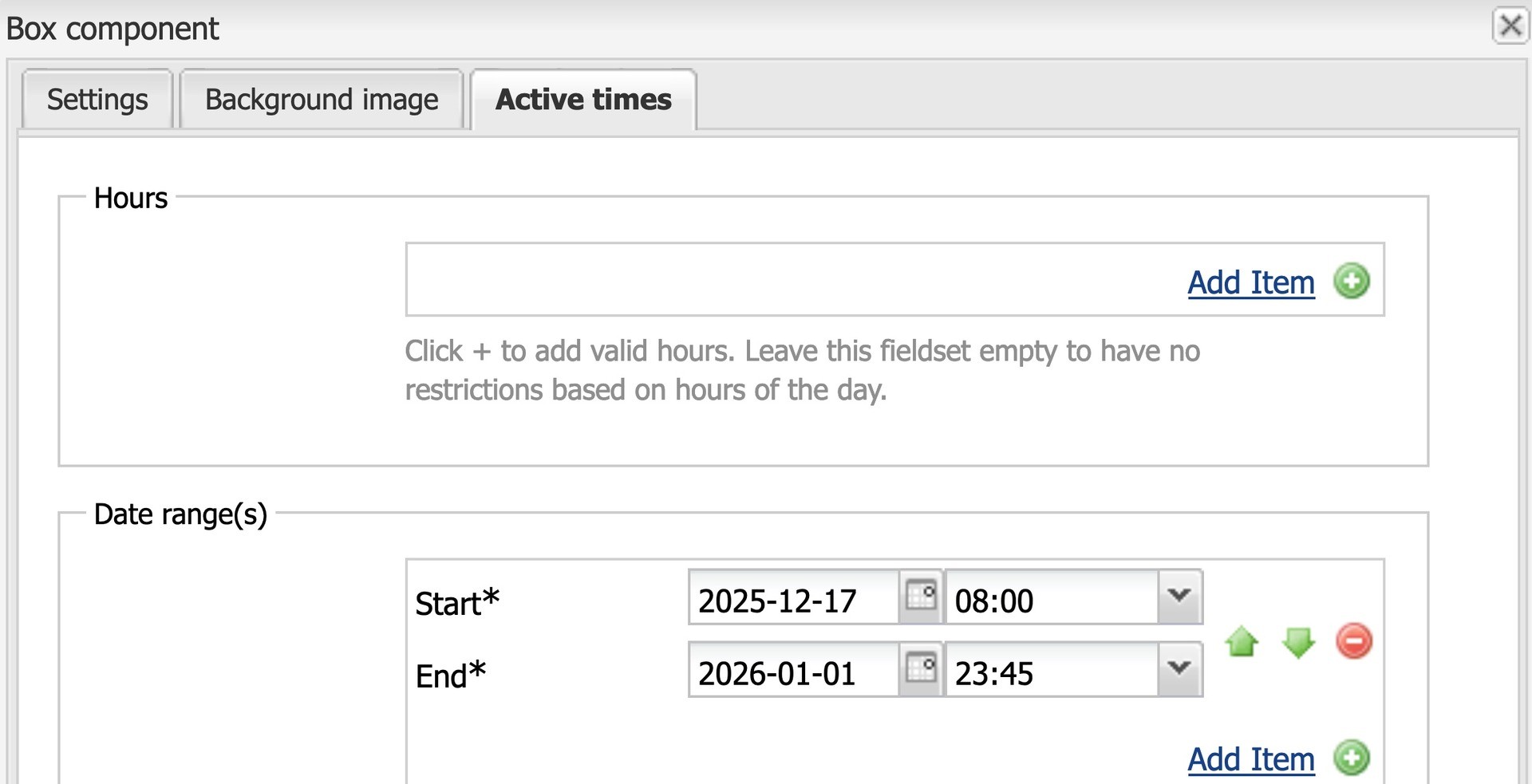
If your content is temporary and you want to hide it after a certain date, you'll need to set the box active times:

Screenshot of box component active times. Start date is set to 2025-12-17 and end date is 2026-01-01.
  1. Open the box for editing and go to the Active times tab.
  2. Ignore the Hours section.
  3. In the Date range(s) section, click Add Item. Then fill in the Start and End dates. AEM will automatically fill in the current hour and minute. If desired, clear or adjust the hour and minute.
  4. Click OK.
  5. Activate the page.

During the active times, all the content in the box will be visible on your live page.

Screenshot showing yellow bar with message "Time range constraints are not met and this content will not be visible outside of Author's Edit Mode."

Outside the active times, you'll see a warning message in AEM edit mode: "Time range constraints are not met and this content will not be visible outside of Author's Edit Mode."

Using a Box with a Column Control

If you need to add a Column Control to a page, it's best practice to add a Box and then add a Column Control to the Box. Here's how to do it:

  1. Add a Box component.
  2. Leave the Background type as None.
  3. Set the box Margin to 0.
  4. Add a Column Control component inside the Box.

Later on, if you wish to move the Column Control elsewhere on the page, you can do so by moving the Box.

Accessibility

Follow our Design recommendations. This way, the box and its content will be accessible to people with colour blindness.

You'll also need to ensure that all content inside the box meets accessibility requirements:

  • Proper headings
  • Paragraph text set to X-Large
  • Descriptive links
  • Descriptive button labels
  • Alt text for images

Design options

Colour background

Screenshot of the Box component settings, with background type set to "Colour"

If you'd like a colour background, set the Background type to Colour. Then click the colour wheel and follow the guidelines below.

If the page has a white background

Screenshot of a white page background, with a light grey box and a light burgundy box

If the page has a white background, choose light grey or light burgundy for the box.

Screenshot of a white box with a border, on a white background

Alternatively, you can leave the background set to None and check the box beside Show border:

If the page has a white background and an accent colour (e.g. purple)

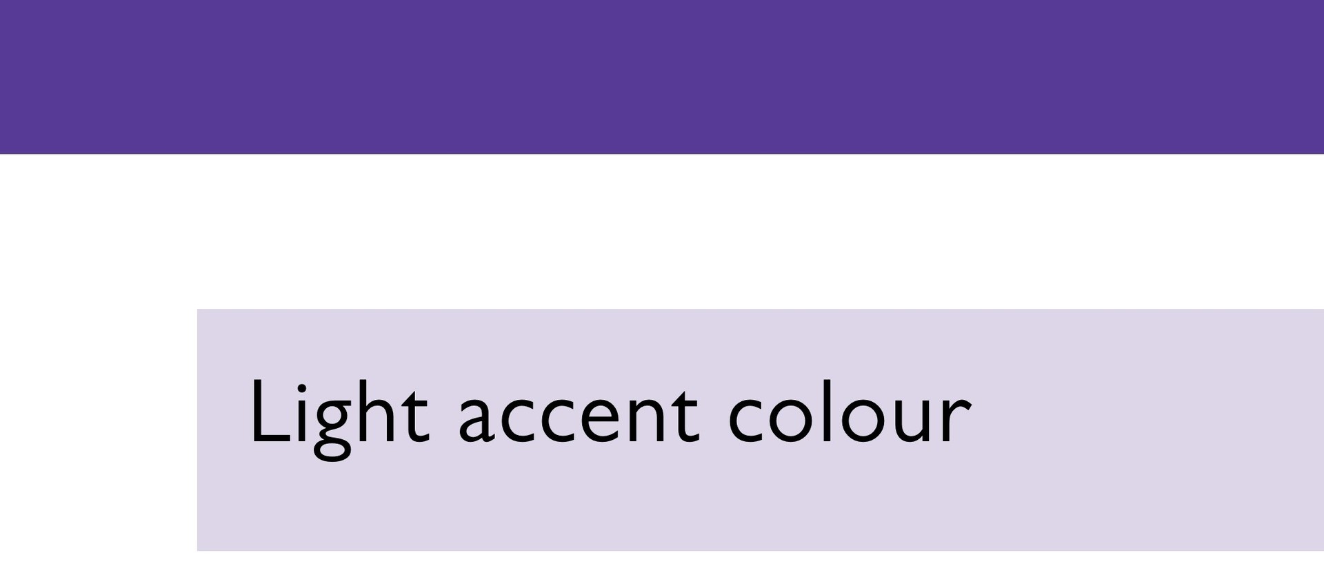
Screenshot of a website with white background, purple accent and light purple box

Choose the light accent colour for the box (e.g. light purple) or choose light grey.

If the page has a light grey background

Screenshot of a light grey background with a white box

Choose a white background for the box:

If the page has a dark background

Screenshot of a dark blue background and a light grey box

Choose a light grey or white background for the box:

Border

Screenshot of a white box with a border, on a white background

Only check the box beside Show border if you have a white box on a white or light grey background.

© Concordia University