This is an advanced component reserved for use by the UCS Web team.
Carousel Multi Items component
The Carousel Multi Items component displays a set of rotating slides. Slides can contain up to 4 items per rotation.

Component(s) you might want to use with this one:
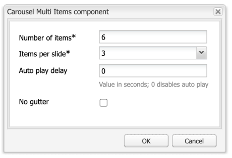
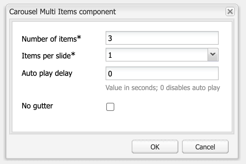
Number of items: This is the total number of items in the Carousel Multi Items component
Items per slide: This is how many items will appear in each rotation, options are 1 to 4 items. The number of items must be divisible by the items per slide. In this example, there are 3 items per slide for a total of 6 items.
Auto play delay: The number of seconds before the slide rotates. Using "0" disables the rotation.
No gutter: Removes the gutter (white space) between items.
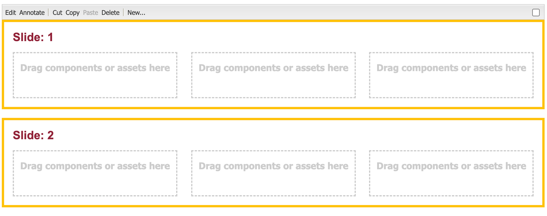
An empty Carousel Multi Item component in author mode
Guidelines
This component is used for decorative purposes, usually to share a series of images for added context and to better portray our campus environment. Keep in mind that users likely will not view every item, so this is not an ideal mechanism for sharing important information. Talk to the Web team to see if this component is the right solution for your content.
Accessibility
- If the component has an image, include the Title and Alt text.
- Be careful to avoid having the slides rotate too quickly. Ensure the user has enough time to absorb the content. A good way to determine this is to read the content out loud and set the time accordingly. For content that is only images, 5-6 seconds is a good rotation time.
Dos
- Use the same component for each item in a slide.
- Use components of the same height.
- Crop images to the same aspect ratio.
Example 1: Card components used for profiles
- The above is set to 3 items per slide for a total of 6 items.
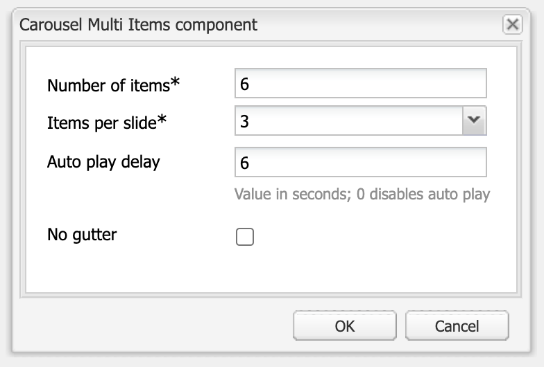
- Auto play delay is set to 6 seconds
Example 2: Image components
- The above is set to 2 items per slide for a total of 4 items.
- No gutter is checked.
- Auto play delay is set to 6 seconds.
- Each Image component is cropped to the same aspect ratio.

Example 3: Using Hero components
- When the content is text, set auto play to 0 so a user can scroll through the content at their own speed.
Don'ts
- Don't use items of different heights: This will cause the page height to shift when switching to the next slide.
- Don't combine different components, it will look messy.
- Don't use this component for important information, as the user might miss a rotation.
- Don't rotate content so quickly that a user can not absorb the information
Need support?
The Web team is here to help.


