Table
The Table component allows you to organize and present data in simple rows and columns – much like a Word table or an Excel spreadsheet.
Examples
The Shuttle bus page uses a table to show the schedule:

The School of Health uses a table to show their nutrition services and prices:

Best practices
General
- Only use a table if it's the best way of presenting the information. If you're unsure whether a table is the best way to present your information, contact websupport@concordia.ca.
- About half your website visitors will be on their phone. If you use a table, it needs to be clear and easy to navigate on mobile.
- Keep the table as simple as possible:
- Concise text
- No more columns than needed, and never more than 5
- No more rows than needed
- Concise text
Set up a table
- Finalize your table content in Word or Excel.
- Add a table component to your AEM page and open the component for editing.
- Copy the table from Word/Excel and paste it into the AEM editing window.
- Follow the Accessibility and Design guidelines.
Accessibility and Design
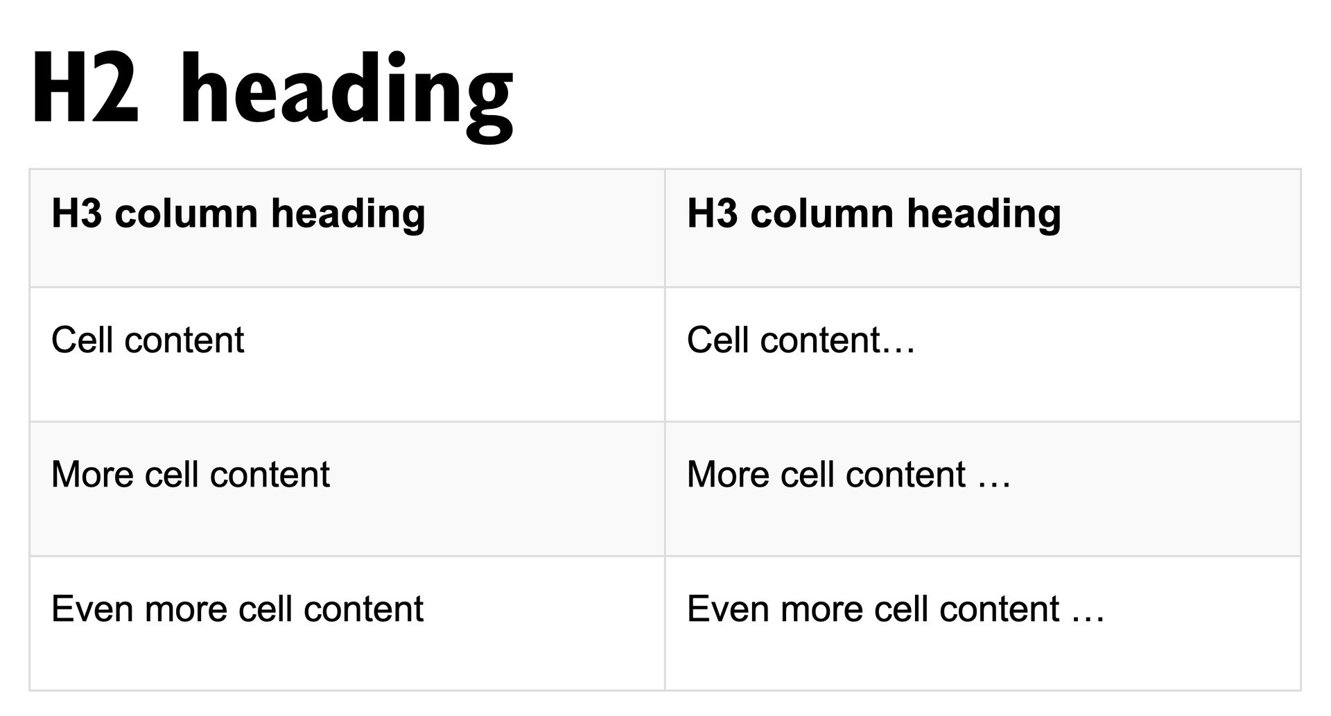
Appropriate headings, lines, shading and text size are the keys to making a table accessible and easy to scan.
- Ensure the heading text is clear and concise. For example, revise "Expenses every year" to "Yearly expenses".
- In the Table tab, place your cursor in the top left column. From the Format dropdown, select the correct heading level. Repeat for the remaining column headings.
- If there's an H2 just before the table, the column headings need to be H3s.
- If there's an H3 just before the table, the column headings need to be H4s.
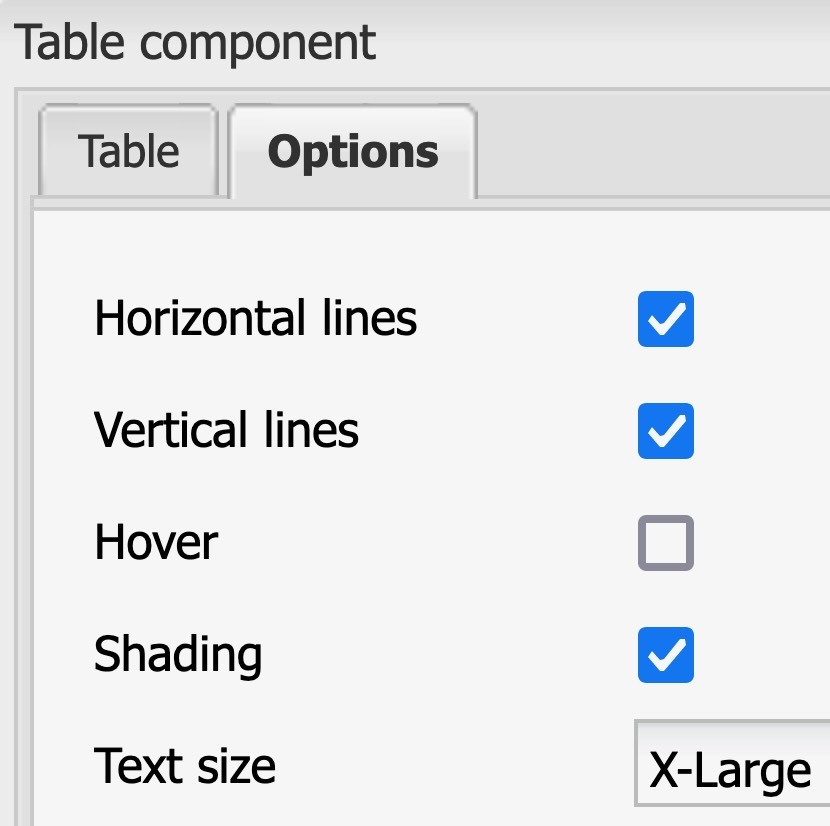
- In the Options tab, check the boxes beside
Horizontal lines
Vertical lines
Shading
and set the Text size to X-Large.

Your table will then be accessible and easy to scan, like this:


